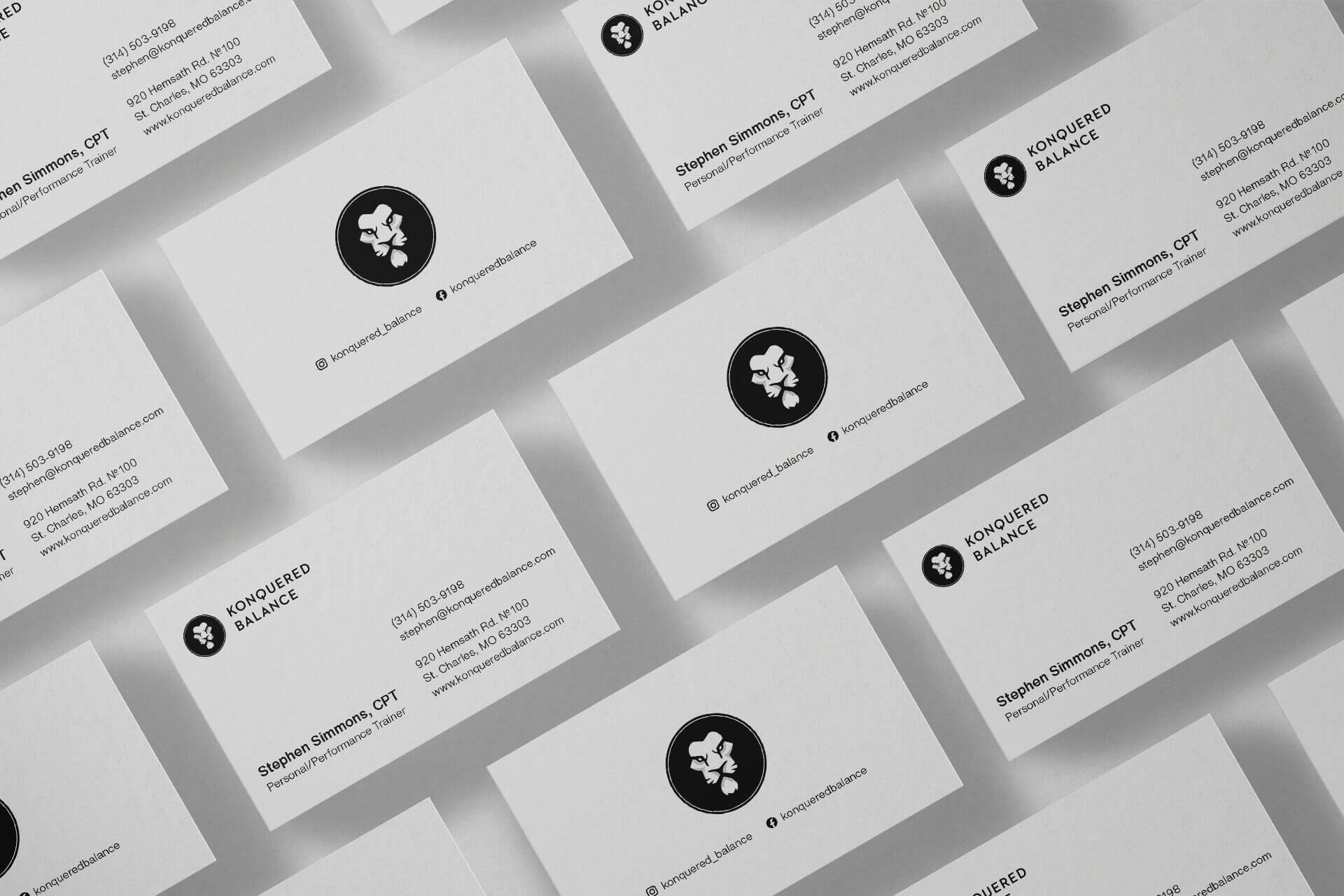
Brand identity for certified personal trainer
Konquered Balance offers elite athlete training programs that combine multiple training techniques, nutrition, and manual therapy to ensure optimal performance for the preseason, in-season, and offseason of any sport.

Founder, Stephen Simmons, took a brave step when he decided to resign from his successful career to pursue his passion and dream—go into business for himself and help others achieve their fitness goals.
Brand Identity Challenge
I wanted to create a professional brand image that can stand out and be trustworthy. After conducting a
discussion with Konquered Balance and going through some key questions, I began analyzing its industry
competitors.
Additionally, I defined the tone of voice, character type, and the overall mood for the brand.
I worked closely with Stephen to develop a brand identity that
matched the ferocity and intensity of his workout routines. Stephen was very open and gave me a lot of
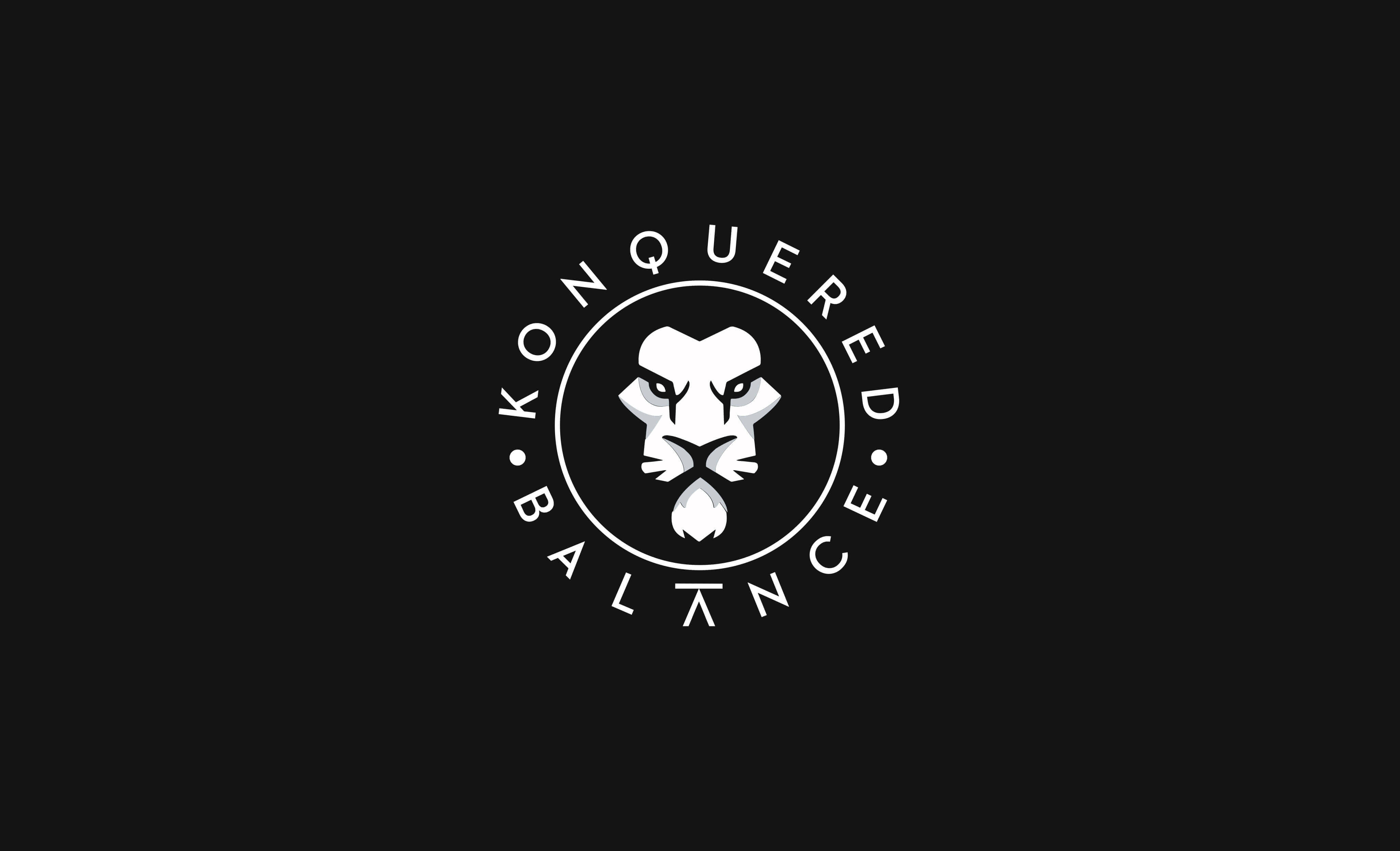
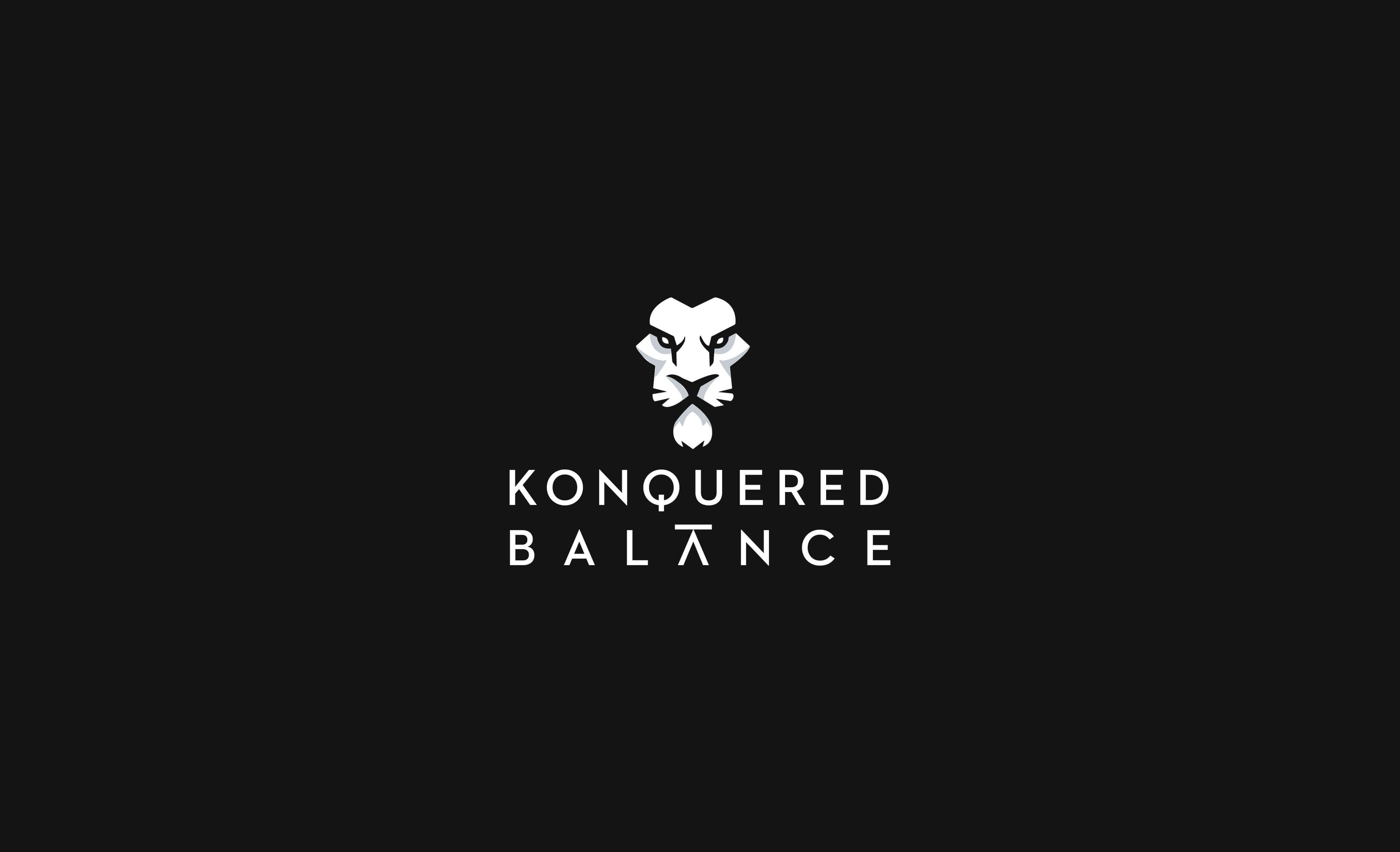
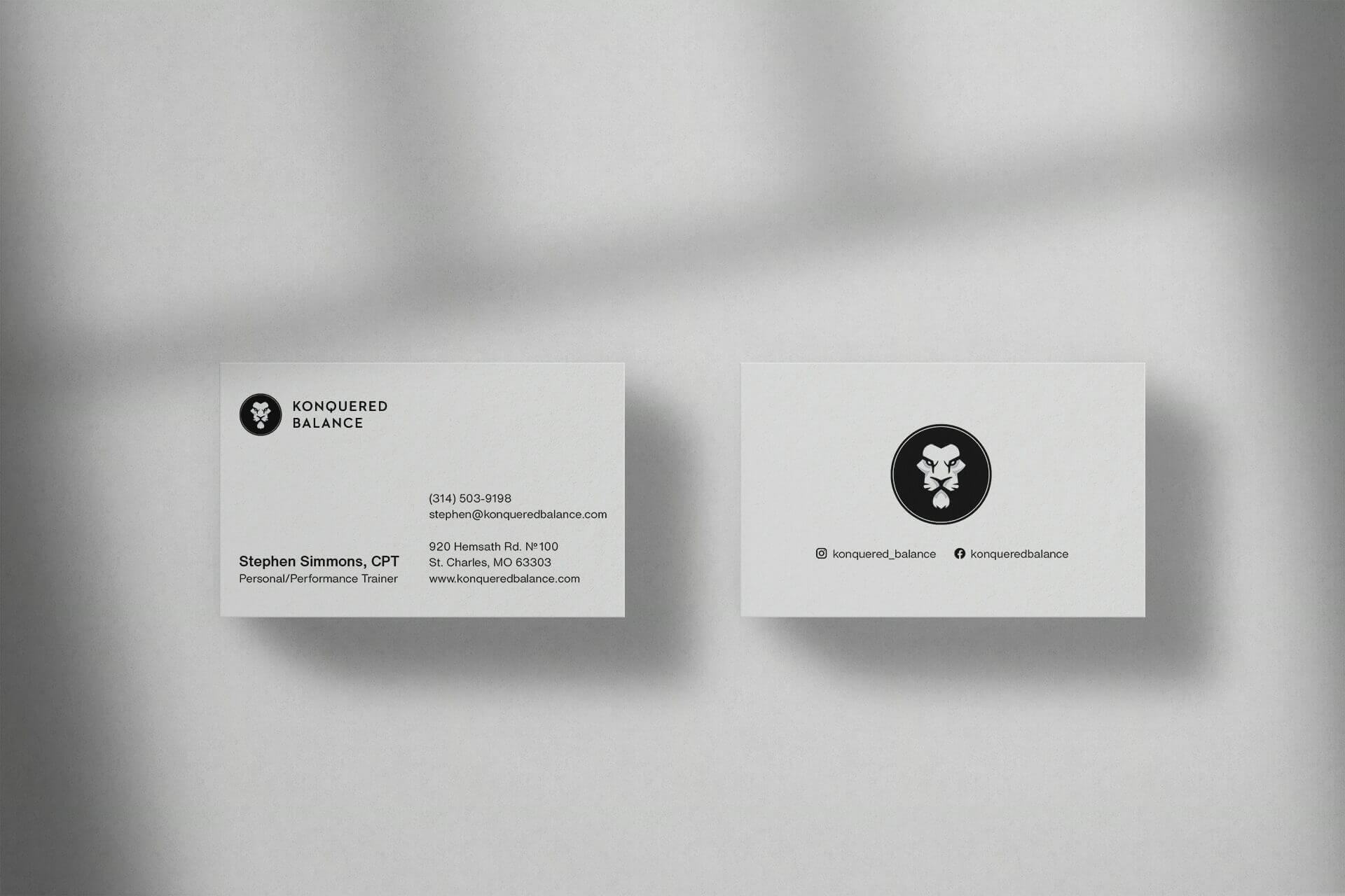
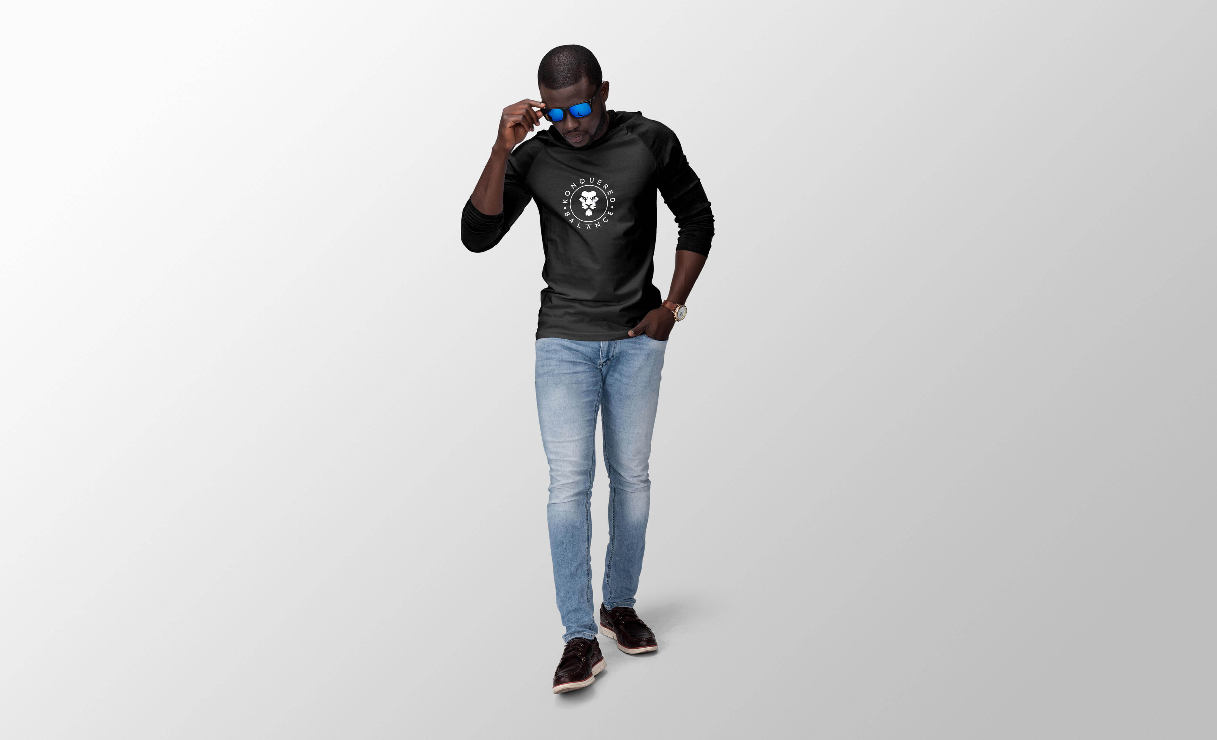
autonomy. The only direction he gave was that there needed to be a lion in the identity. The logo consists
of lion head to symbolize strength and courage.

Typeface
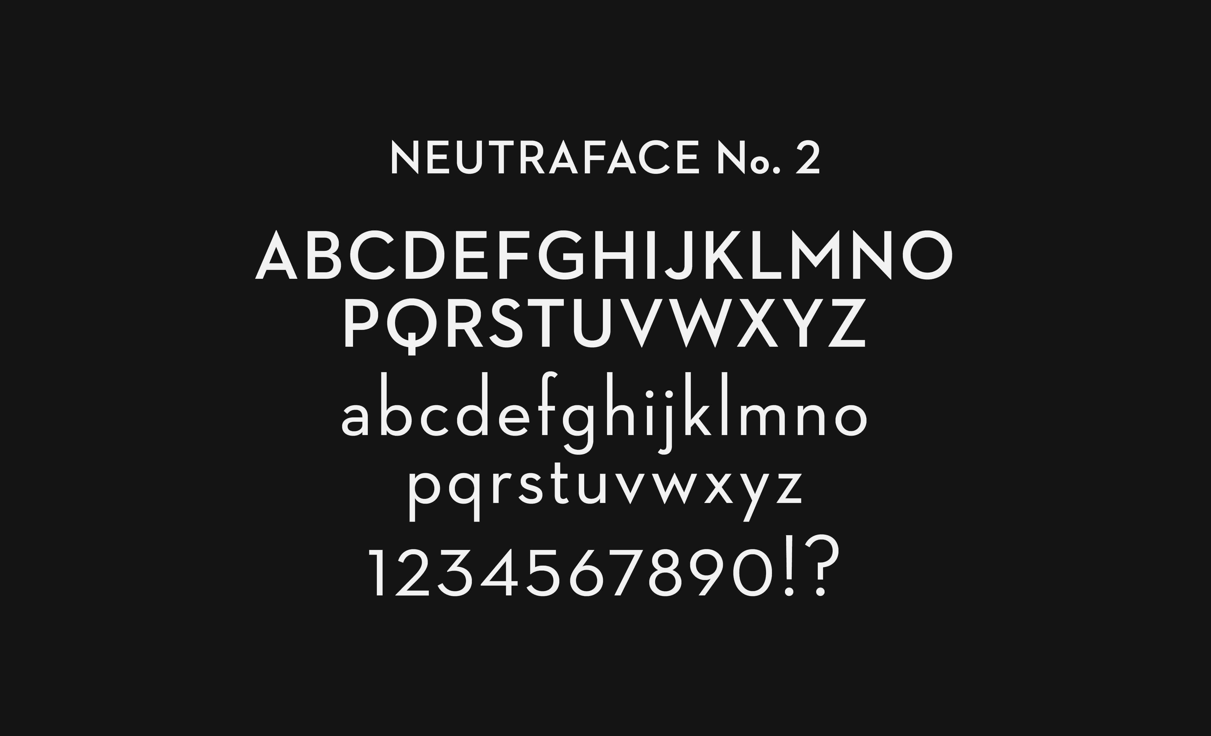
The logo is paired with typography set in Neutraface No. 2 (designed by House Industries), a geometric typeface whose symmetry emphasizes the balance in the company's name.
